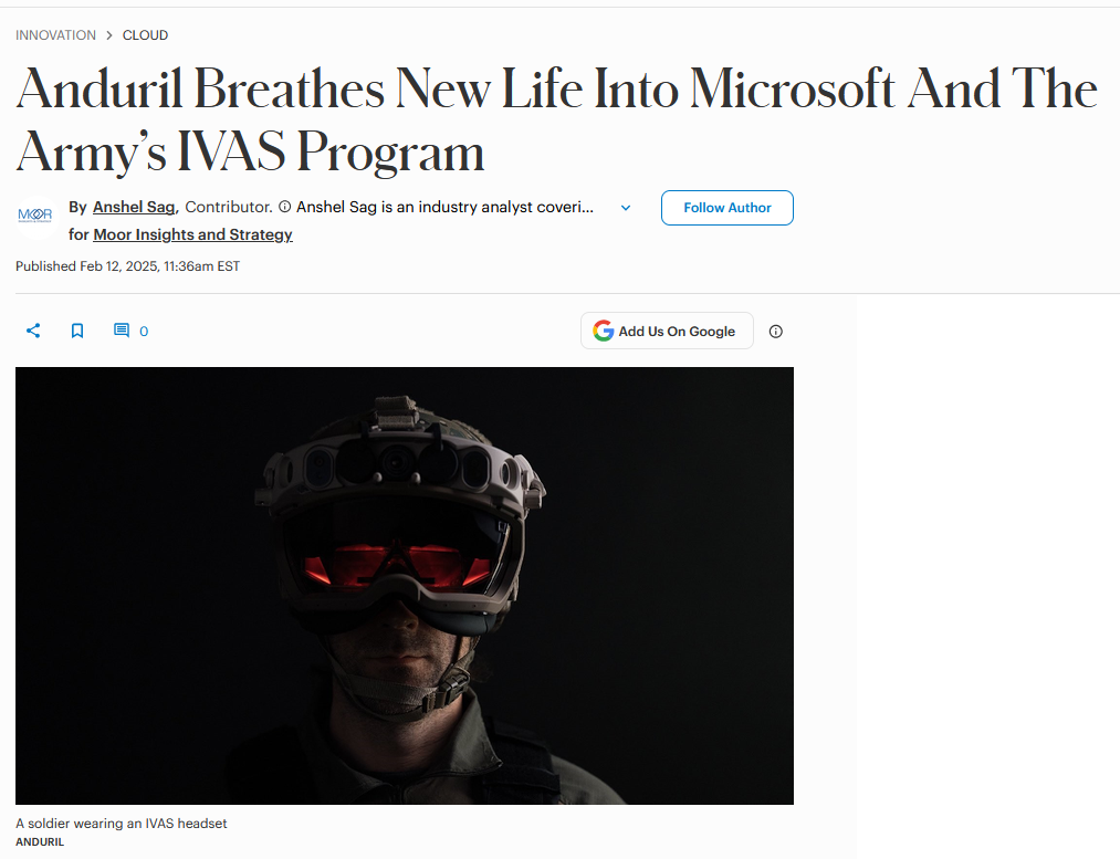
The problem
The HUD was first shown to the Army as a functional demo, and development never slowed down enough to replace that foundation. Years of iteration without a system left visual drift, recurring UI bugs, and navigation that changed from feature to feature.
Principles
Before any components, we defined what the HUD had to protect.
Seeing the real world comes first. Interface always yields to surroundings.
As simple as the job allows. One eye, one thumb.
No one-off patterns, no special cases.
Built to flex to any org without breaking.
Process
Research
With the user research team, I gathered insights from user feedback and program managers, and studied Microsoft's existing design systems so the HUD could sit inside the ecosystem without losing its own character.
Collaboration
I shared early screen concepts with engineers and technical designers first, so the stakeholder pitch could answer technical questions with confidence.
Design and documentation
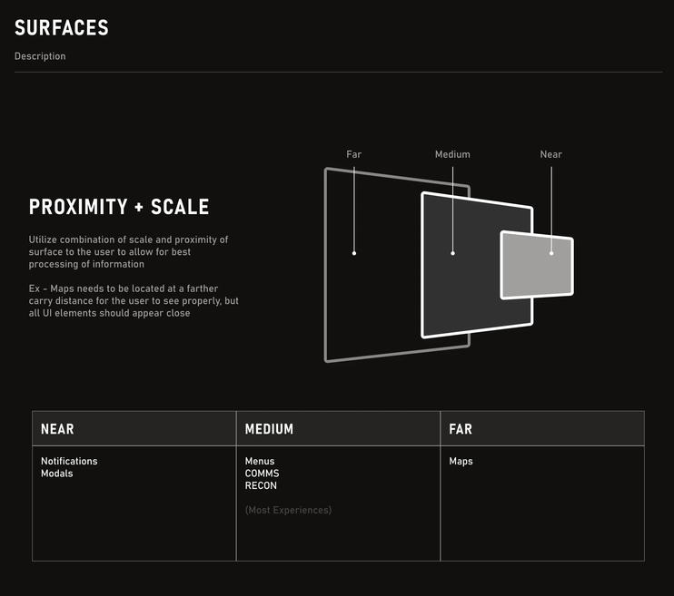
I built the system in Figma with support from my design lead and a second product designer, to industry standards but carrying the headset's constraints.
Challenges
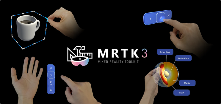
Stakeholders loved the pitch but worried about abandoning work already built. The plan that won, recommended by a technical designer on the team: adopt MRTK3, Microsoft's open-source mixed reality toolkit, incrementally, folded into feature rework already planned. And when the team ran short on Unity-experienced designers, I learned MRTK3 and built the UI components in-engine myself.
Results
As features were reworked, their UI was rebuilt from system components: implementation got faster, UI bugs dropped, and the improvements became part of the case for the program's continued funding. The system's foundations outlived the program itself, carrying through its transfer to Anduril.
In the press · Forbes, Feb 2025 ↗