The brief
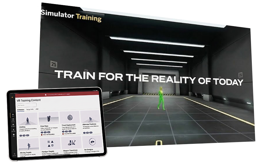
Axon's VR TASER training platform ships alongside a tablet companion app. I was brought in to consult on Design System 2.0, and the scope grew into systems, tooling, illustration, motion, and video across both products.
One effort · Part 1Design System 2.0
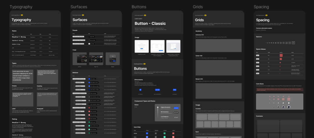
The old system (DS 1.0) for the TASER Training product was slow to build on and lacked visual polish. I was brought in for prior work in design systems and mixed reality. Most of my scope was Design System 2.0, which had to work on both the VR headset and the tablet companion app. My brief was VR, but the products share the system, so I built a large share of the tablet components and screens as well.
I ran a visual-direction study to set the target: stakeholders each mapped where the product was, where it should go, and which references they trusted, and I synthesized those into the direction we built against.
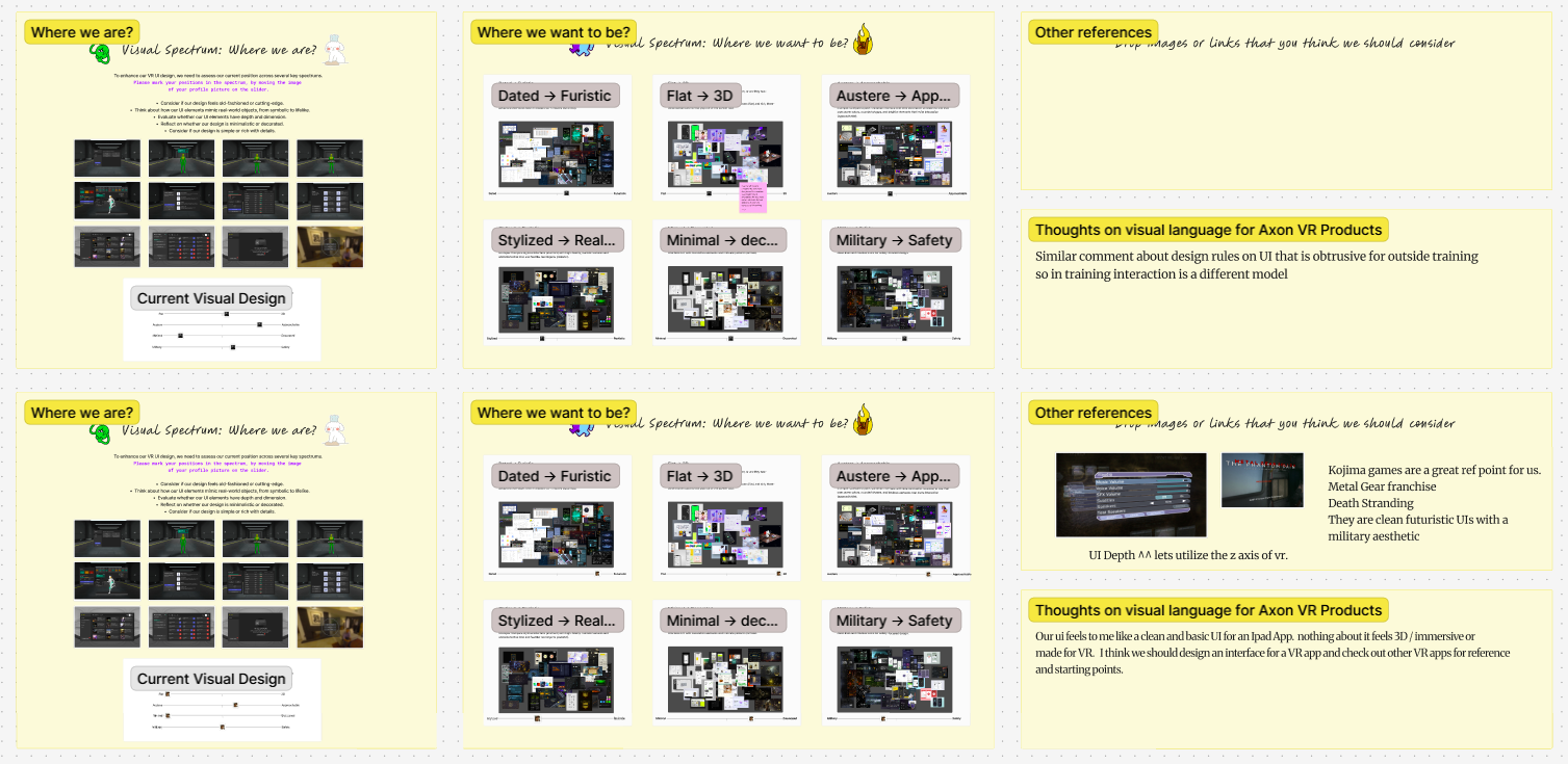
I owned the direction and the component architecture, and built the library. 80+ components and standards, now used by 2 product teams.
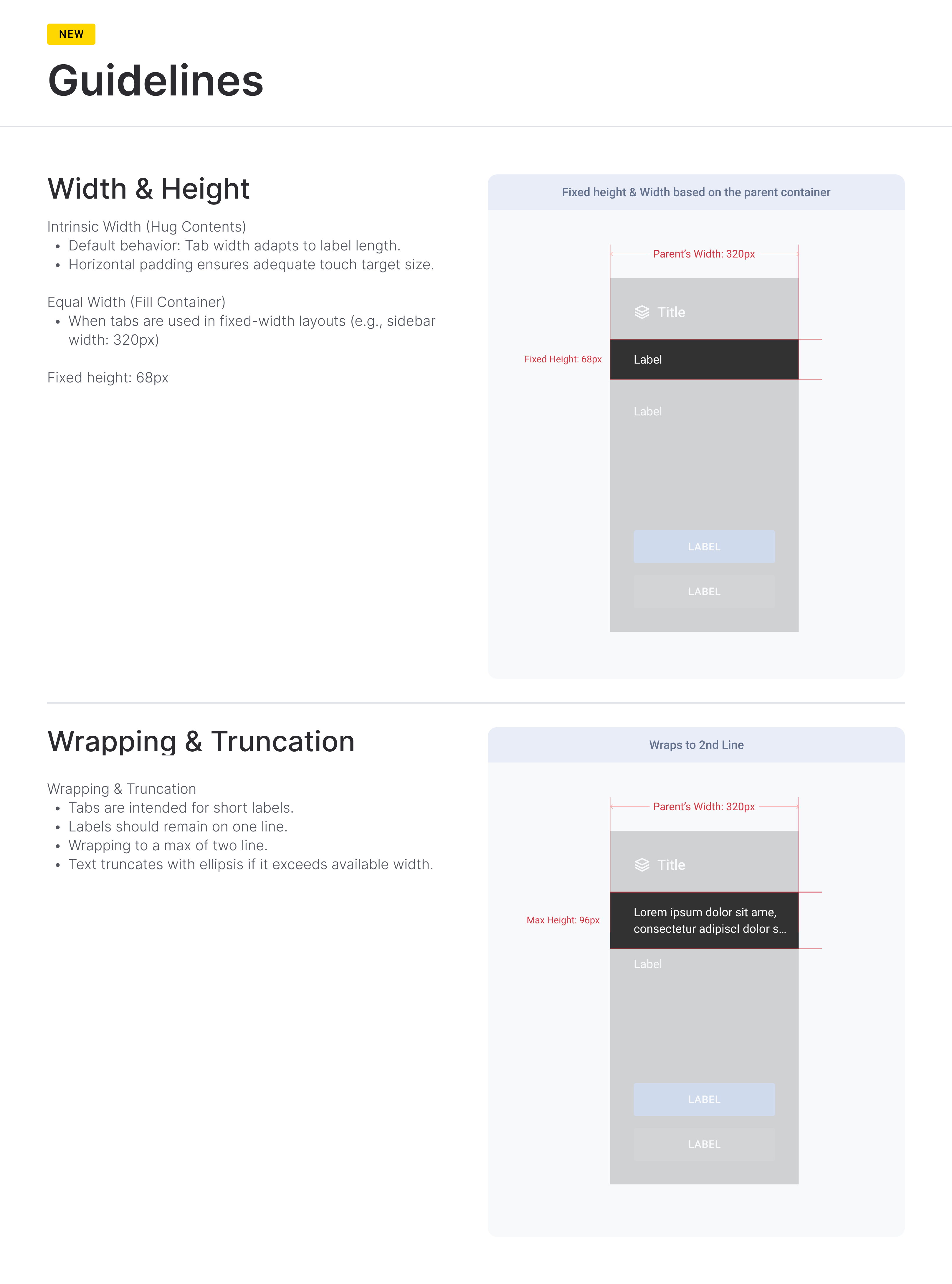
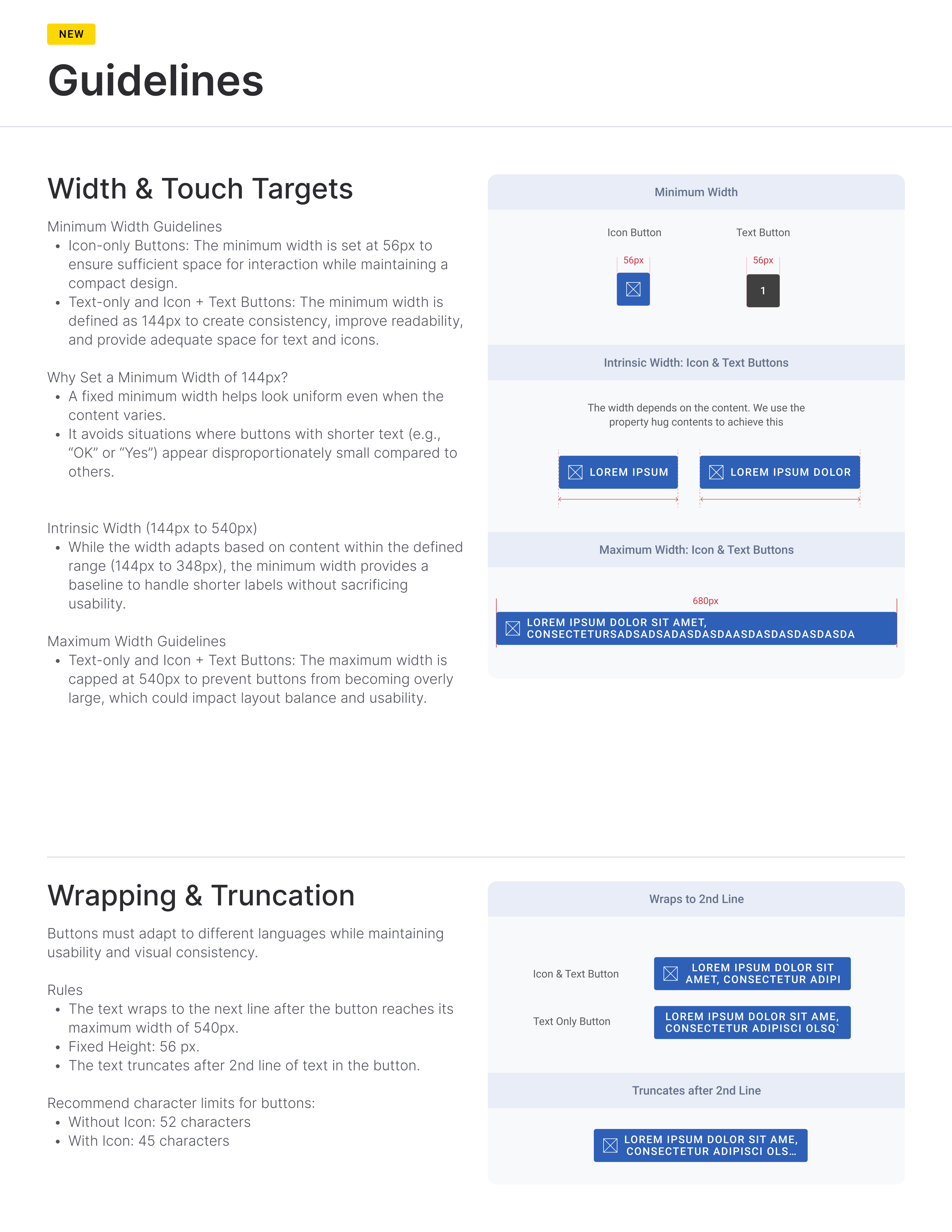
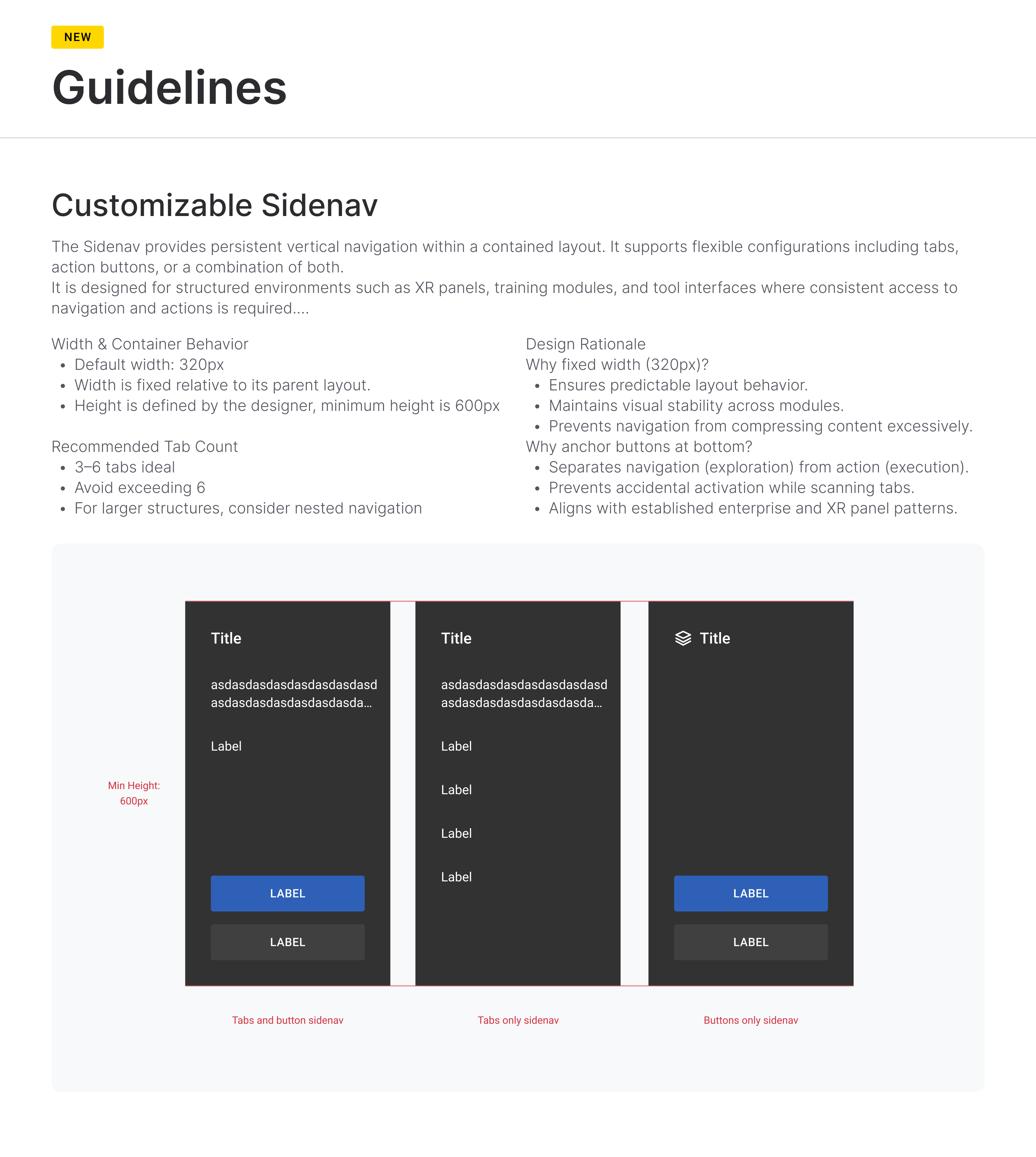
Components had to translate to Unity without interpretation: tokens as Figma variables, consistent naming, documented responsive and truncation behavior. That constraint shaped the architecture from the start.
Rebuilding 1.0
1.0 had to be rebuilt on the new environment for current customers regardless. I rebuilt that library and structured the tokens so 2.0 ships as a theme switch on the same components instead of a second migration, validated with theme-switching tests in Noesis.
One effort · Part 2Figma to Unity
Design changes required a manual rebuild in the engine, which took 3+ days per iteration. I started by building and evaluating our components in production middleware, Noesis and Coherent, against our real UI. Neither met our requirements, and we moved to building a pipeline of our own.
The pipeline was a 3 person effort. A teammate set up the Cursor rules with our Unity conventions, and an engineer built the Unity-side bridge the model uses to construct UI in the editor. I handled the Figma side: documented components with tokens wired to variables, redlines, type styles, and responsive and truncation rules. The AI builds against those specs and checks its output with them.
The 3 of us worked with the model directly to build screens. Turnaround dropped to same-day, and all five designers now ship UI to the engine without an engineer.
Real-time feedback
With the new system infrastructure in place, we redesigned the real-time feedback mechanics from the older training sessions. I specced the motion and worked with an engineer to build the functional prototype. We A/B tested old against new in a user test day with officers, then surveyed them after. Officers consistently preferred the new mechanics, reporting it was easier to track their performance during a session, understand what they did, and see how to improve.
Icon redesign
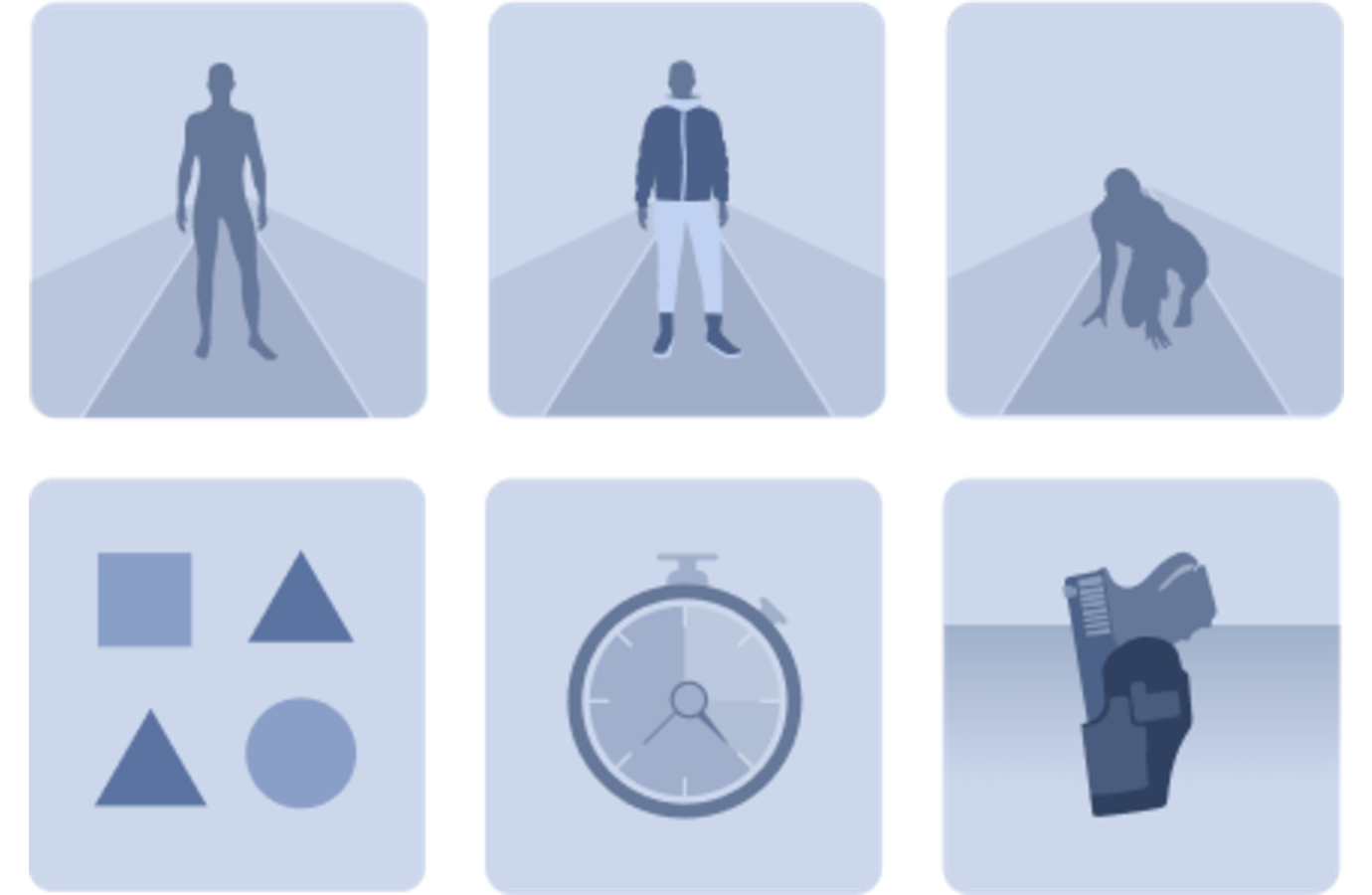
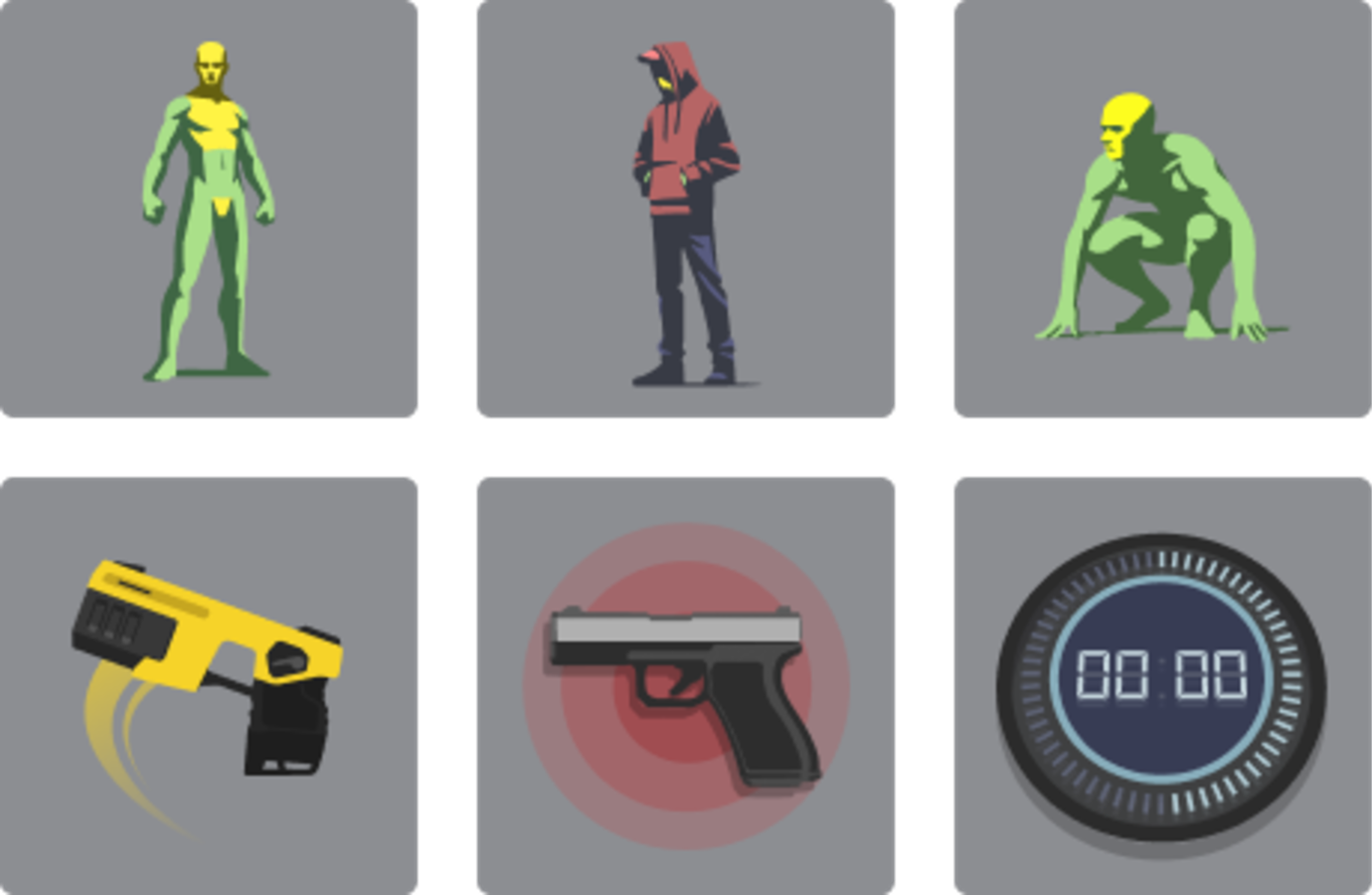
The icon set was part of a broader style refresh. I set a new illustration and motion direction built for VR hardware limits and spatial legibility, covering 100+ illustration, motion, and video assets across both apps.