The problem
Each Destiny 2 expansion needed new destinations and activity types introduced in a way that felt familiar to returning players but signaled "something new" clearly enough to pull them back in.
Approach
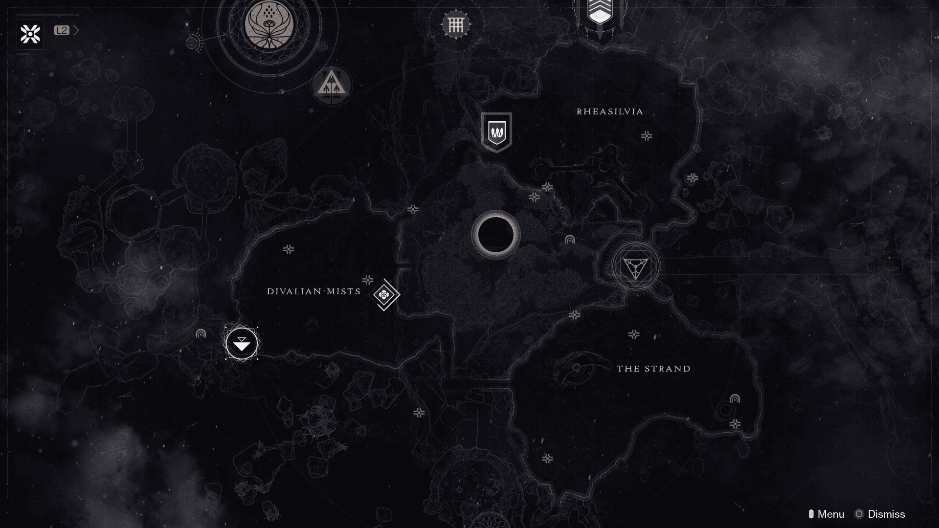
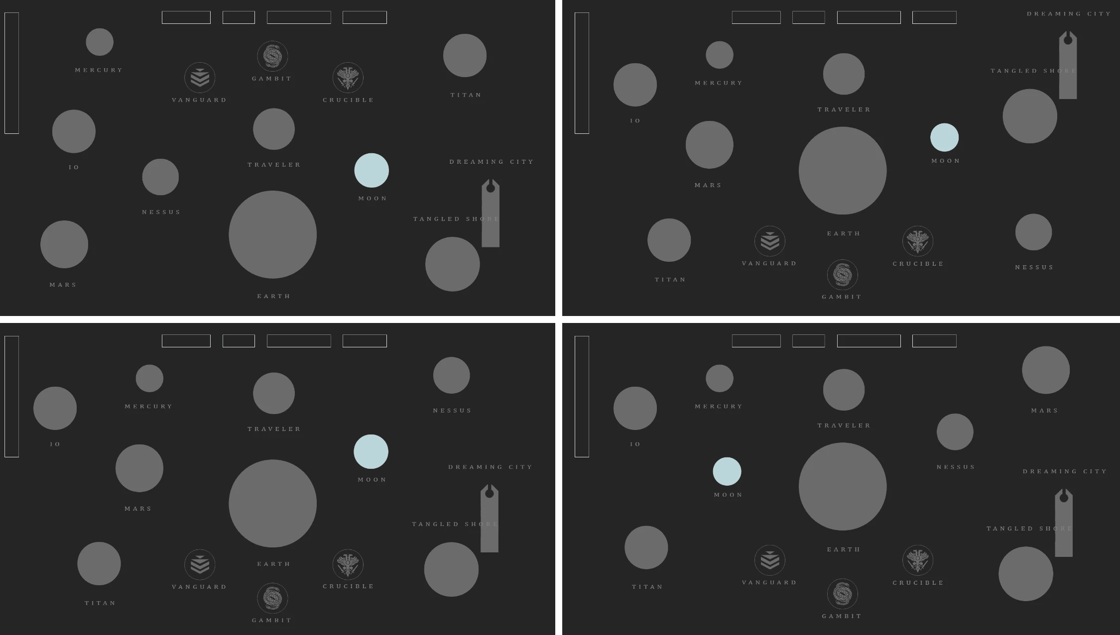
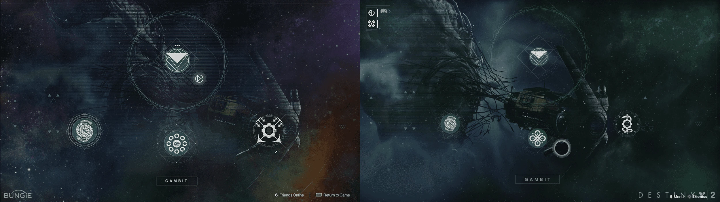
- Shadowkeep Director: low-fidelity wireframes for the new Moon destination, designed to emphasize the new area while keeping the overall Director layout familiar
- Visual design: Photoshop mockups translated into in-game implementation, using red nebula imagery to pull the player's eye toward the new destination
- Gambit activity screen: new launch screen designed to organize the growing set of Gambit activities by priority
- Gambit score HUD: a visual cue system that alerts each team when their banked motes score is dropping, a gameplay blocker players needed to see instantly
Shipped design
Director & destinations
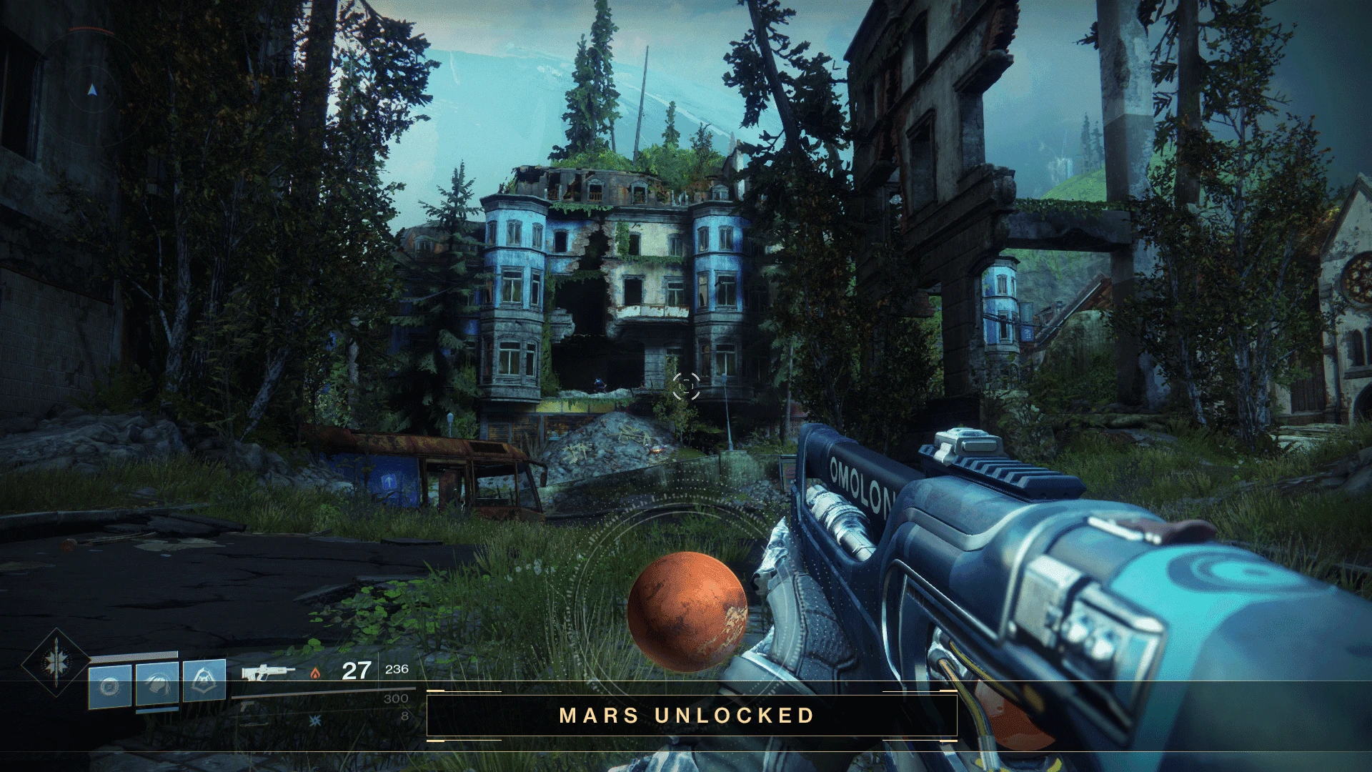
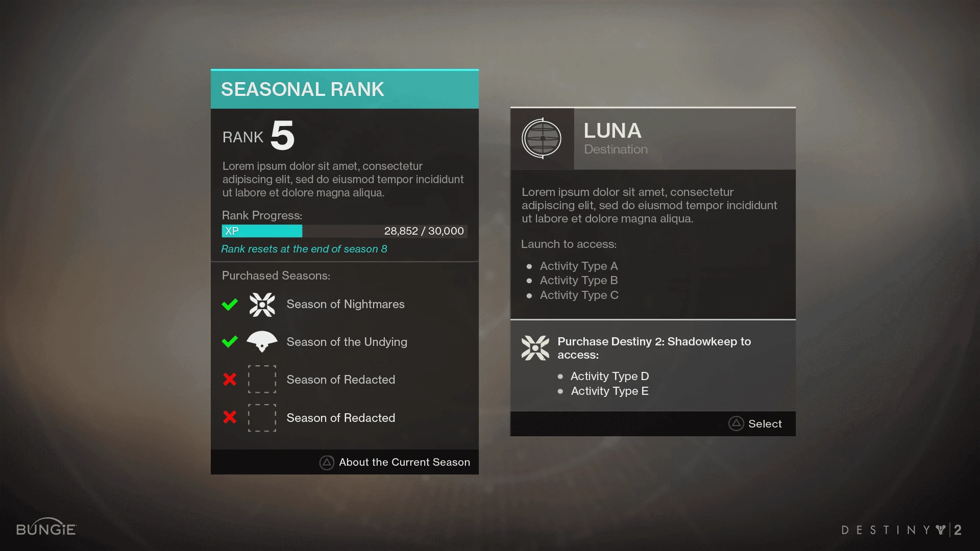
Destination reveals and Director maps, built to spotlight new areas while preserving the layout players already knew.
Activities & seasons
The Gambit activity maps and the seasonal rank screen.
Weapon inspection
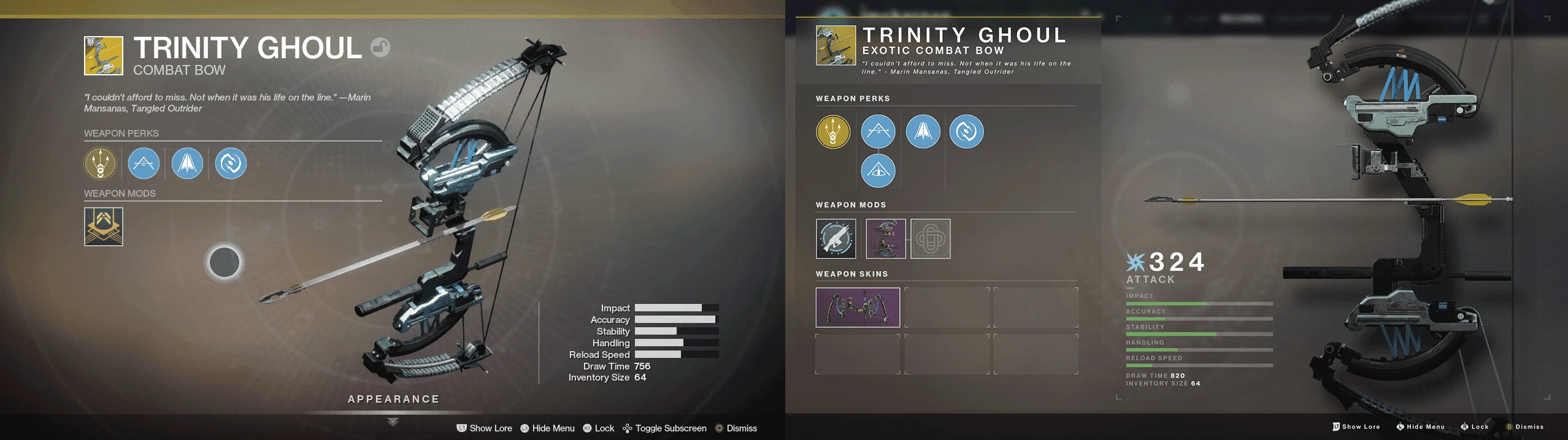
A redesign exercise on the weapon inspect screen, in the current Destiny aesthetic.
In motion
Crucible menu at scale
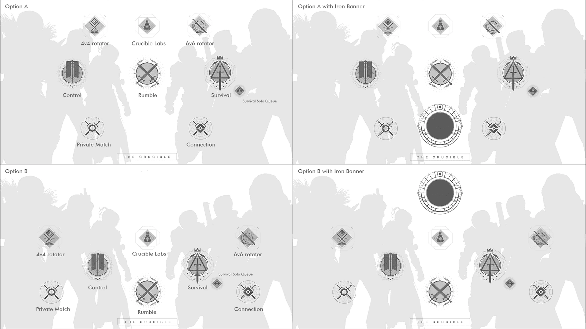
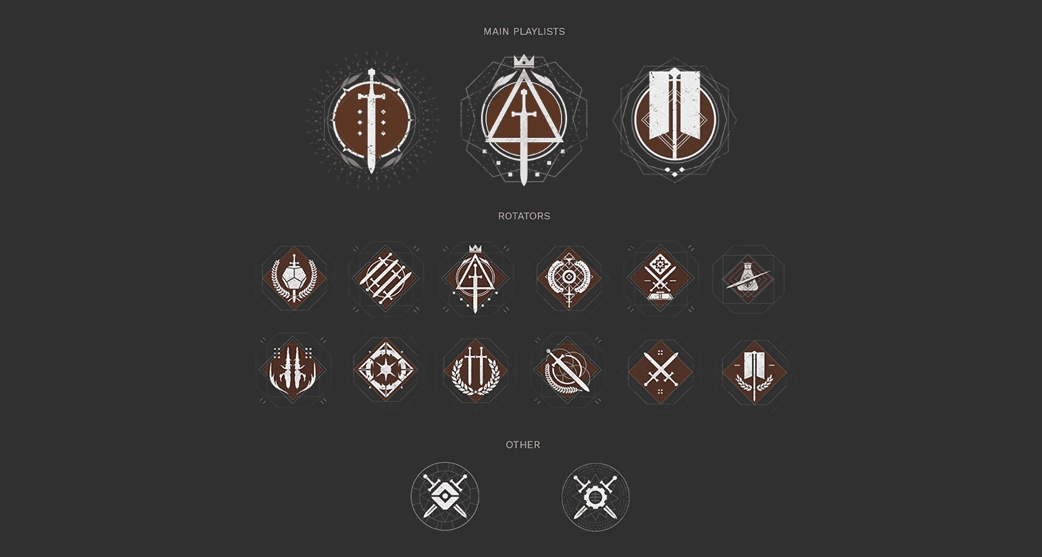
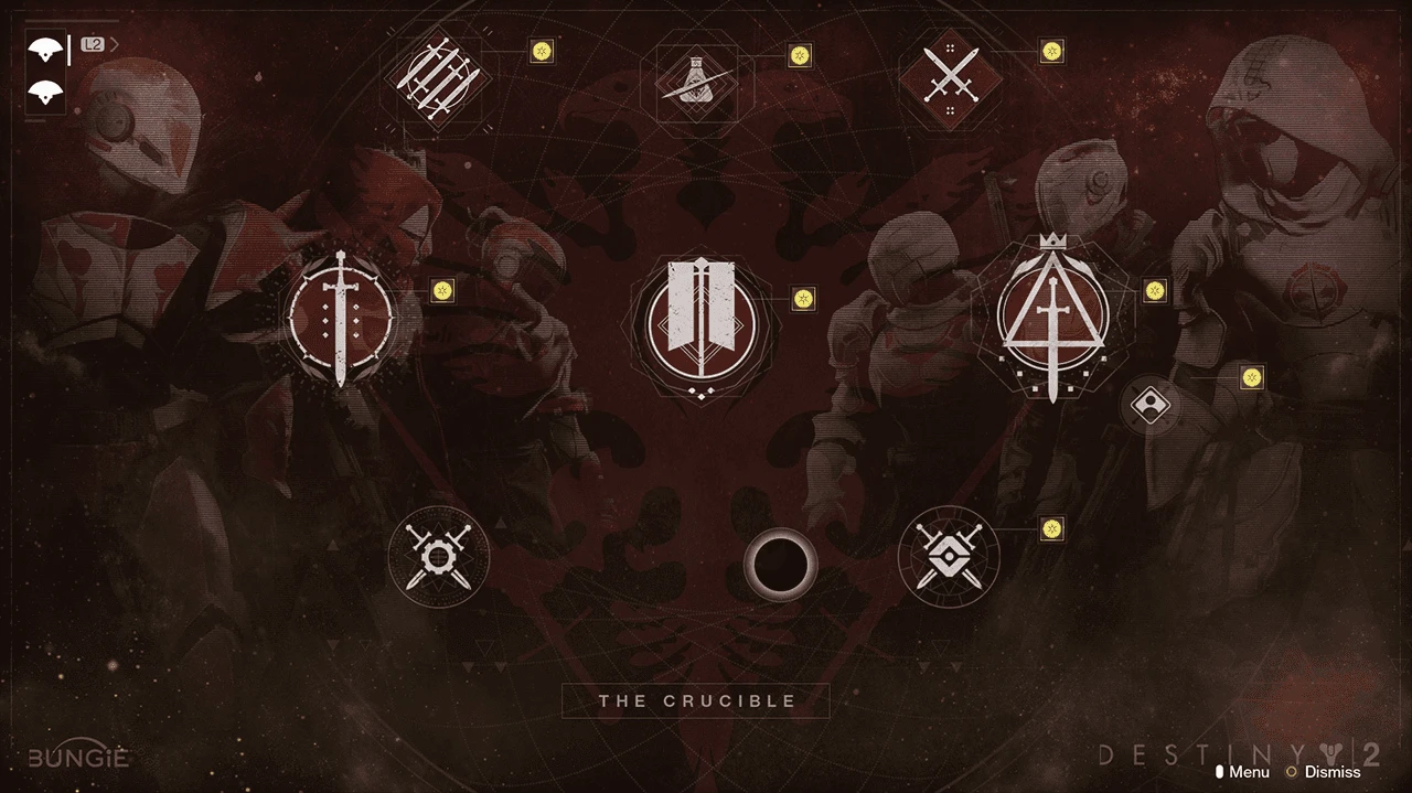
As feature lead for the PvP menu, I redesigned the Crucible screen to grow from 6 playlists to 18 plus the monthly Iron Banner event, without reshuffling the layout hardcore players had memorized.
From wireframes to shipped
Layout options tested with and without Iron Banner, the icon system that marks persistent playlists with circles and weekly rotators with diamonds, and the shipped menu variants.
Iconography
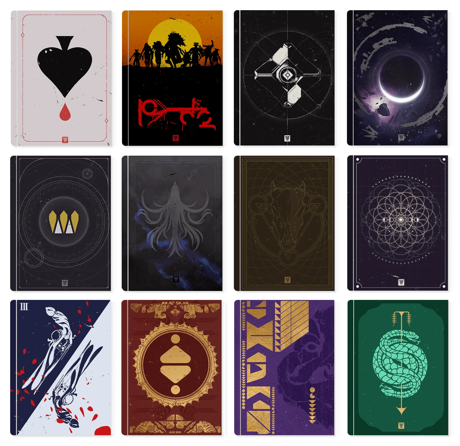
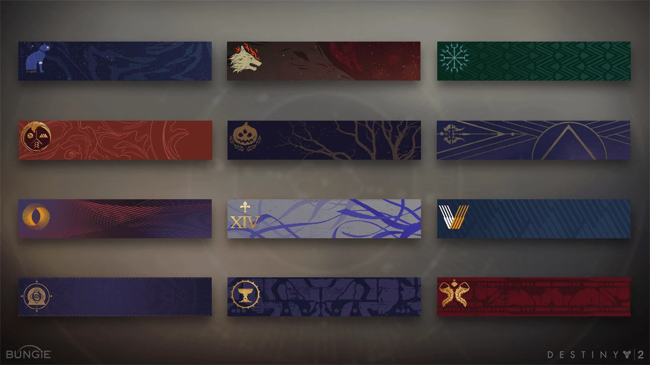
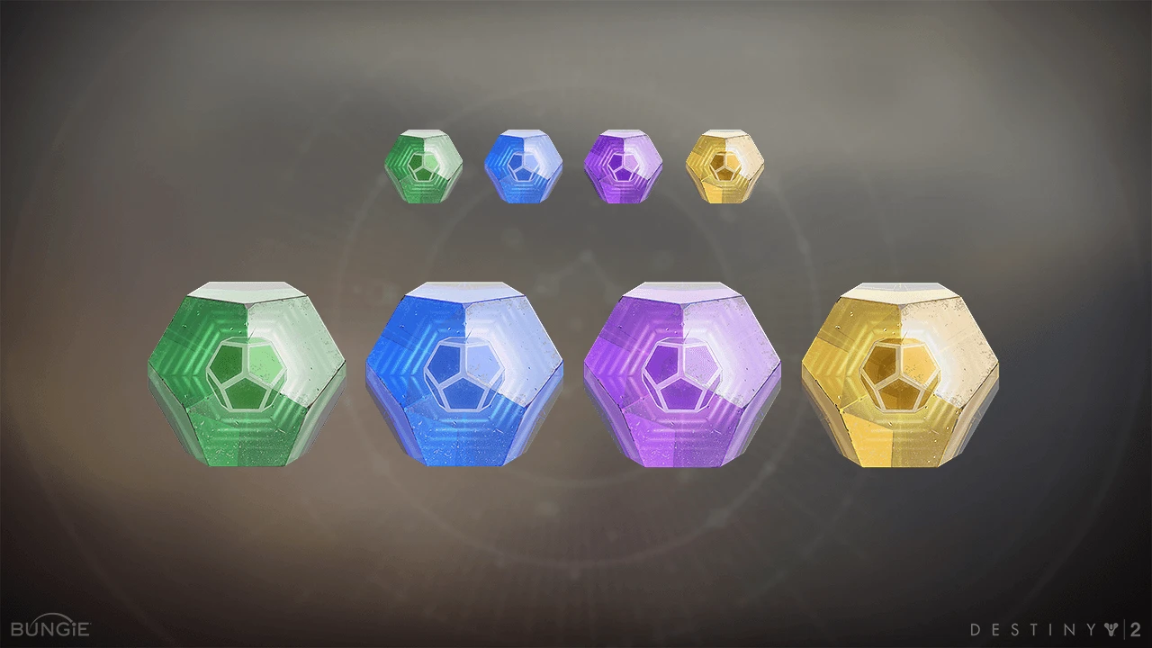
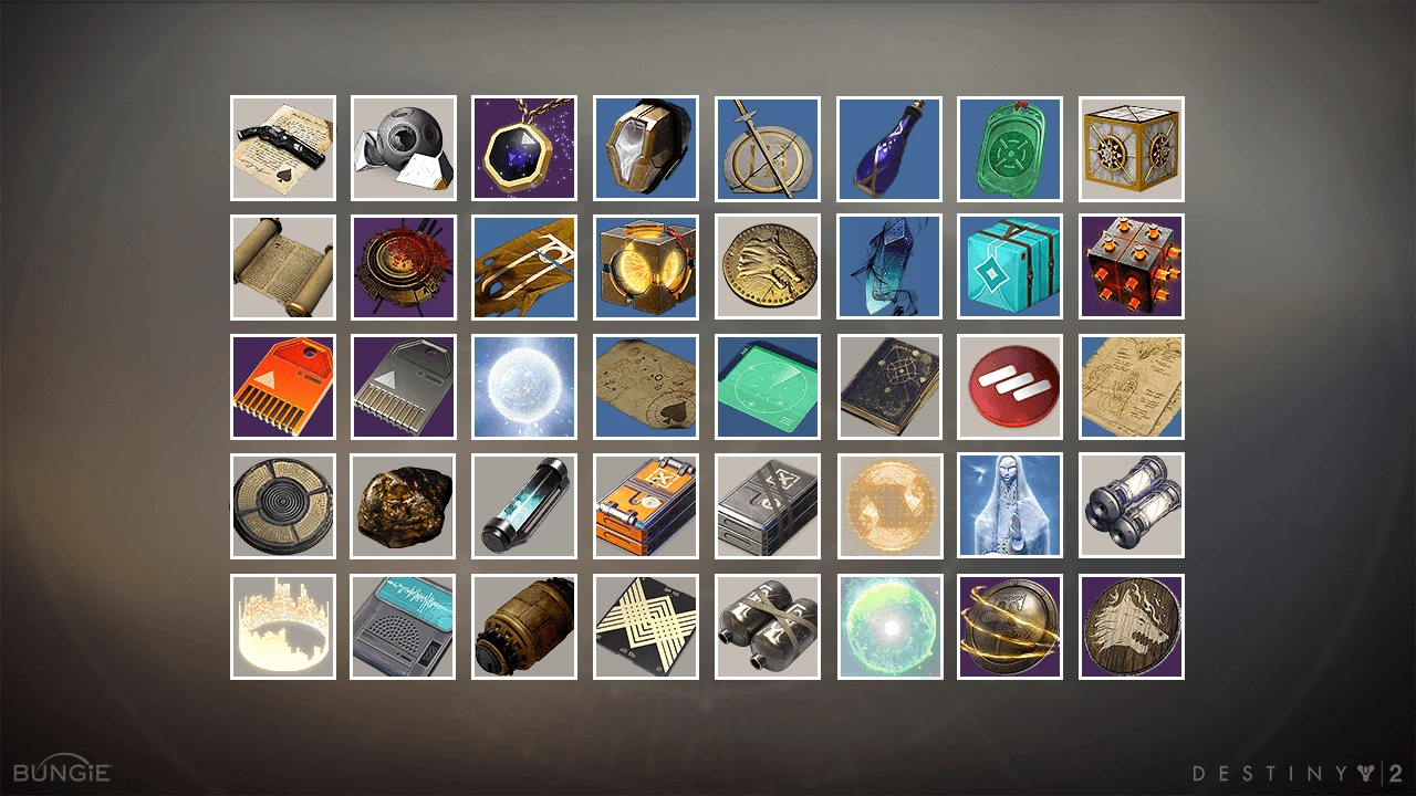
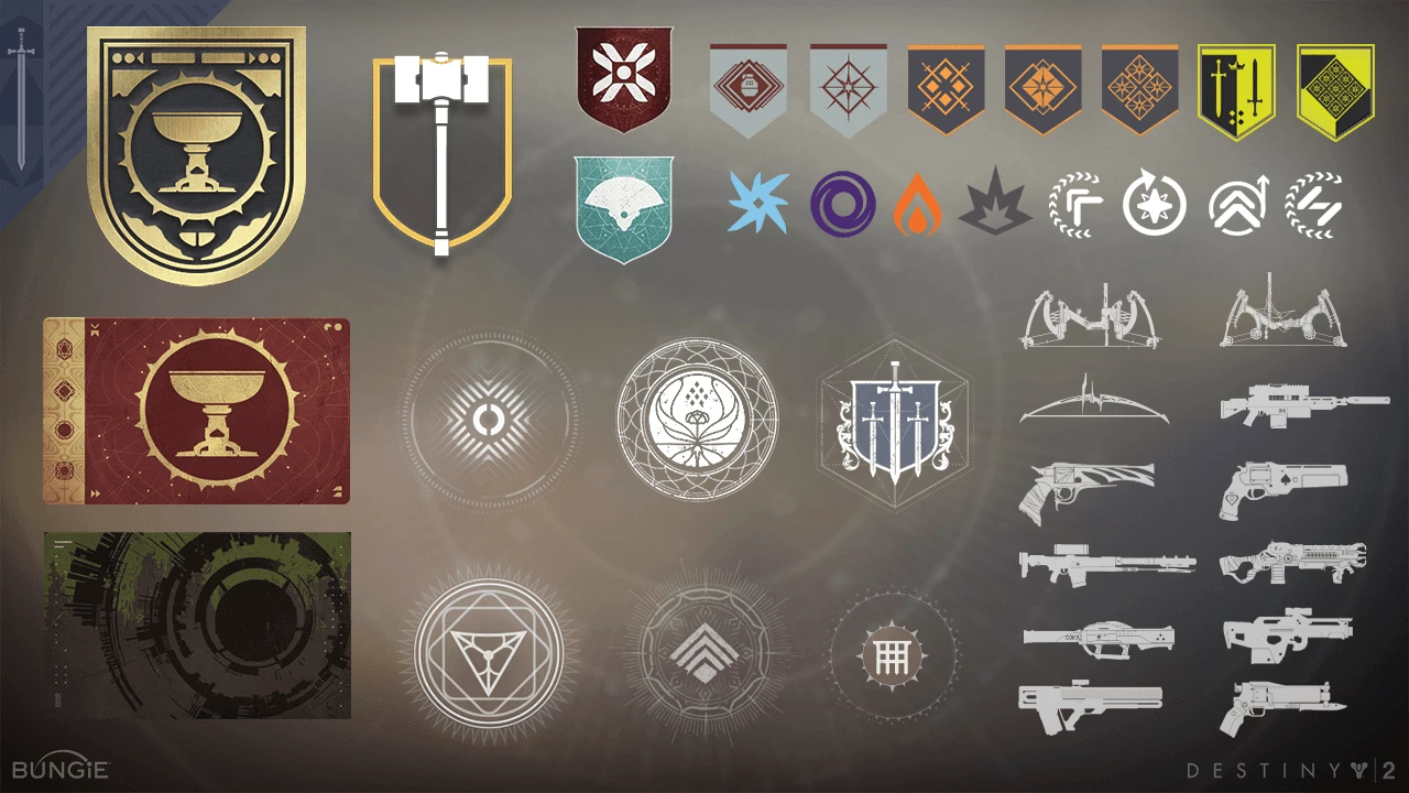
Alongside the screen work, I built and shipped over 800 icons across Destiny's lifespan. The system spanned lore books, player emblems, and HUD elements, and every icon had to read clearly at HUD scale while holding up as a full 3D render in marketing.
A sample across the three icon categories. Click any sheet to view it full-size.